Insitu
8 styles, 4 weights
Light, Light Italic, Regular, Italic, Bold, Bold Italic, Black, Black Italic
8 styles, 4 weights
Light, Light Italic, Regular, Italic, Bold, Bold Italic, Black, Black Italic
About Insitu
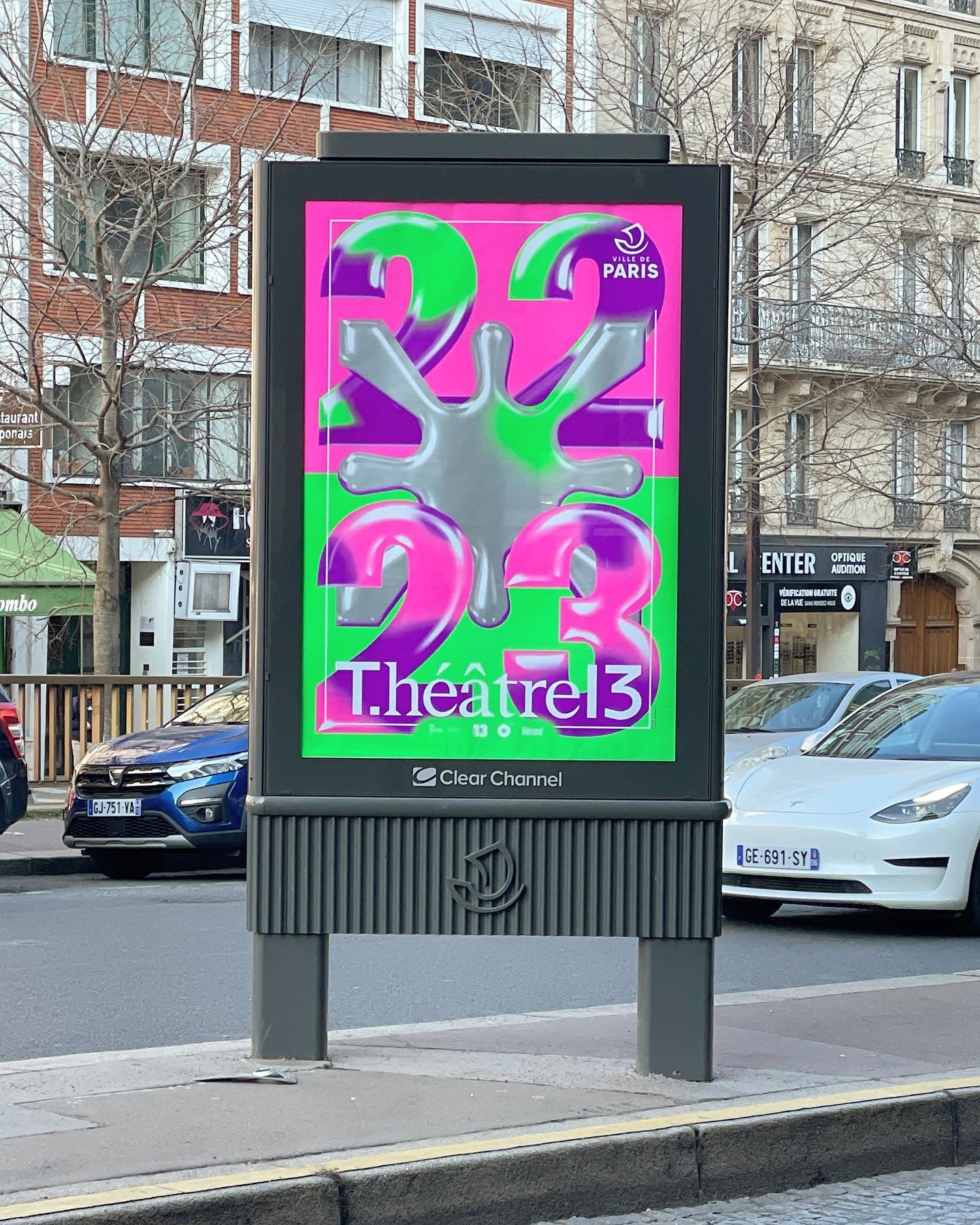
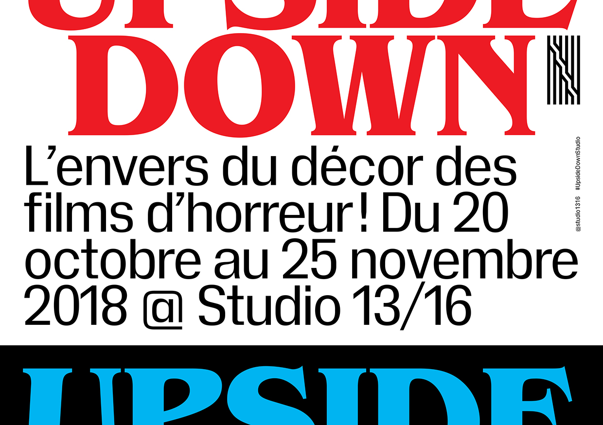
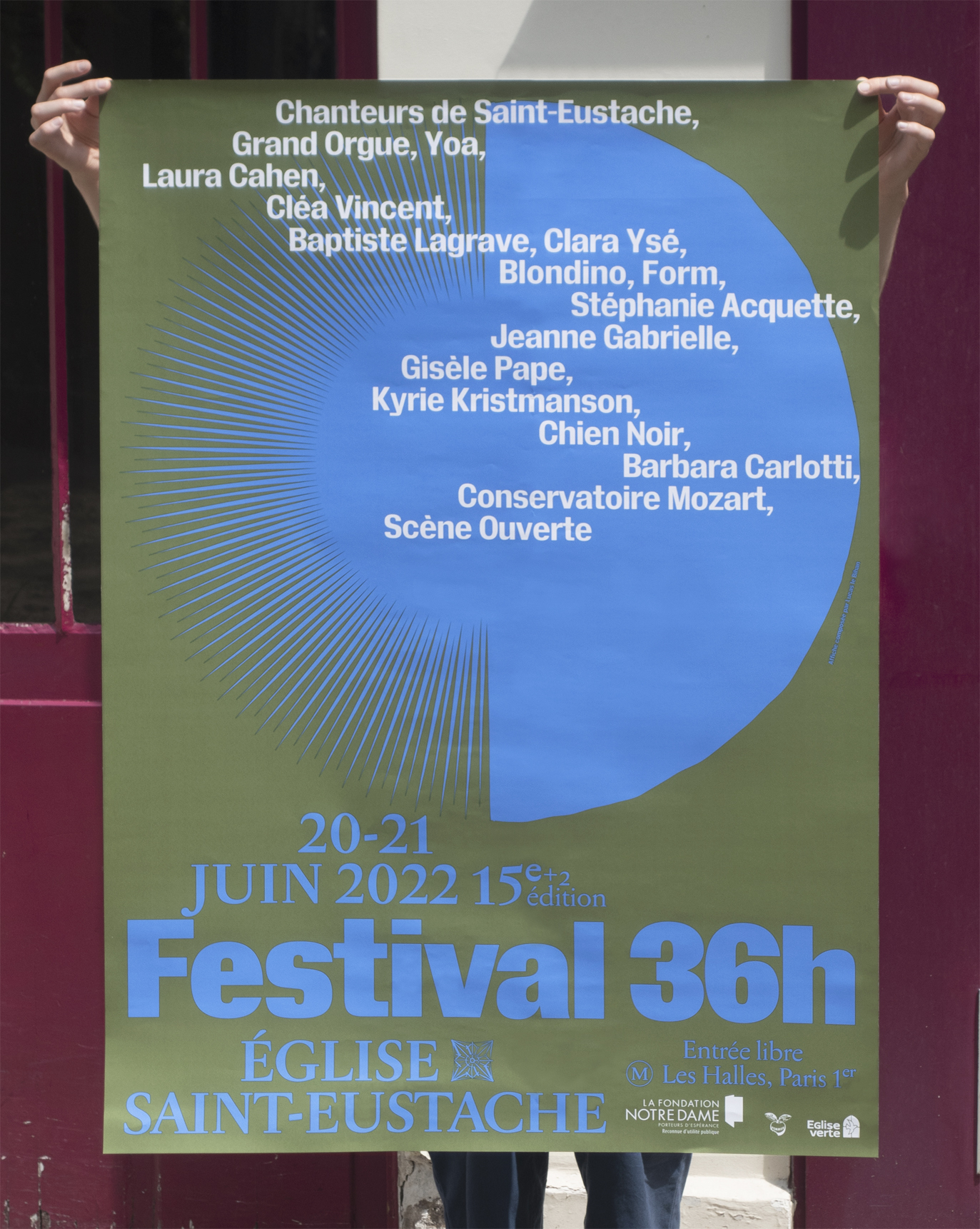
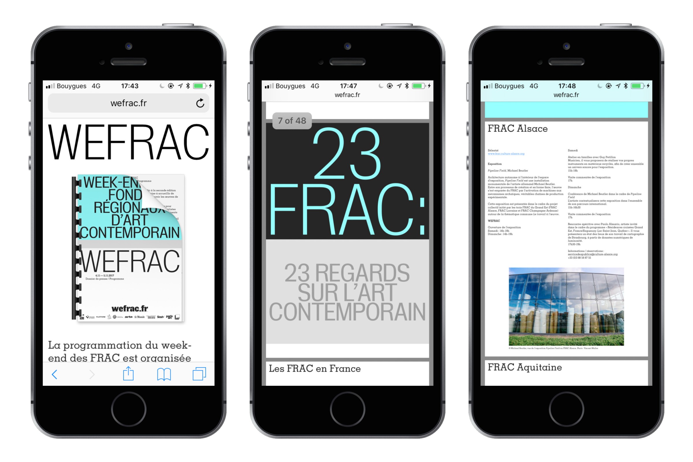
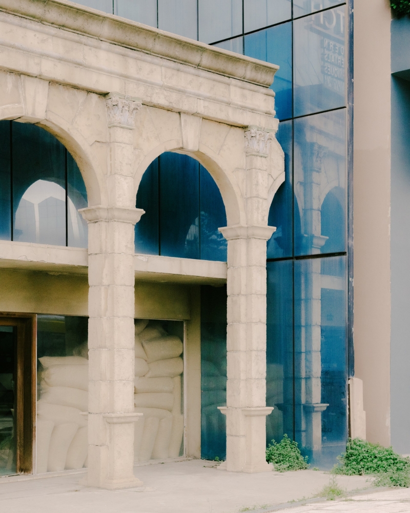
Initially drawn for the ISELP art institute in Brussels (BE) and further developed for WEFRAC, the French Regional Contemporary Art Funds Open Days event, Insitu is a neo-grotesque with tight spacing and nice contrast. Inspired by gothics from the beginning of the 20th century and from classics like Folio, it is our version of the friendly and sturdy sans serif. Insitu is meant to enjoy the lapidar sentences of conceptual art and the heavy magazine titles. It prefers large type settings, though it also manages to stay readable at smaller font sizes and includes italics so it can still be used in a variety of situations.
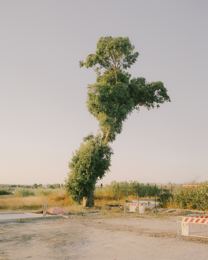
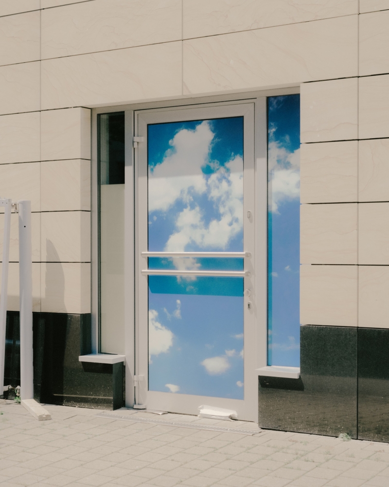
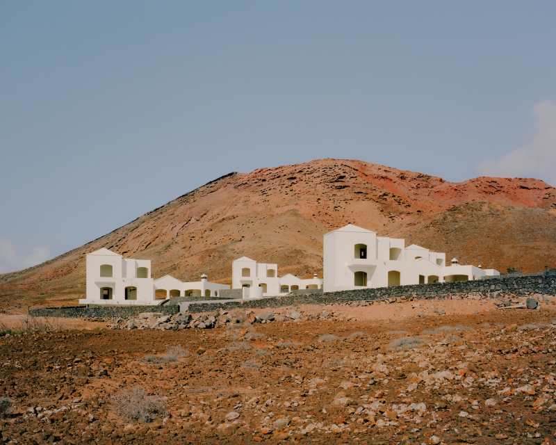
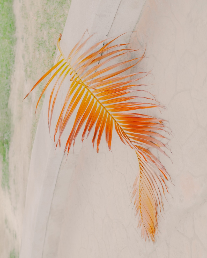
Photography © Maxime Verret
-
DesignersEmmanuel Besse, Lucas Le Bihan
-
Release2022
-
Glyphs702
-
Single weightFrom 75,00 €
-
FamilyFrom 300,00 €

Type tester
The development of musique concrète was facilitated by the emergence of new music technology in post-war Europe. Access to microphones, phonographs, and later magnetic tape recorders (created in 1939 and acquired by the Schaeffer’s Groupe de Recherche de Musique Concrète (Research Group on Concrete Music) in 1952), facilitated by an association with the French national broadcasting organization, at that time the Radiodiffusion-Télévision Française, gave Schaeffer and his colleagues an opportunity to experiment with recording technology and tape manipulation.
124 Islands, 183 Canals & 128 Bridges
124 Islands, 183 Canals & 128 Bridges
It was not until it was getting dark that evening that Gregor awoke from his deep and coma-like sleep. He would have woken soon afterwards anyway even if he hadn’t been disturbed, as he had had enough sleep and felt fully rested. But he had the impression that some hurried steps and the sound of the door leading into the front room being carefully shut had woken him. The light from the electric street lamps shone palely here and there onto the ceiling and tops of the furniture, but down below, where Gregor was, it was dark. He pushed himself over to the door, feeling his way clumsily with his antennae—of which he was now beginning to learn the value—in order to see what had been happening there. The whole of his left side seemed like one, painfully stretched scar, and he limped badly on his two rows of legs. One of the legs had been badly injured in the events of that morning—it was nearly a miracle that only one of them had been—and dragged along lifelessly.
JOHN, DUKE OF BERRY, IS THE FRENCH PRINCE FOR WHOM THE TRÈS RICHES HEURES WAS MADE. BERRY WAS THE THIRD SON OF THE FUTURE KING OF FRANCE, JOHN THE GOOD, AND THE BROTHER AND UNCLE OF THE NEXT TWO KINGS. LITTLE IS KNOWN OF BERRY’S EDUCATION, BUT IT IS CERTAIN THAT HE SPENT HIS ADOLESCENCE AMONG ARTS AND LITERATURE (1988).
JOHN, DUKE OF BERRY, IS THE FRENCH PRINCE FOR WHOM THE TRÈS RICHES HEURES WAS MADE. BERRY WAS THE THIRD SON OF THE FUTURE KING OF FRANCE, JOHN THE GOOD, AND THE BROTHER AND UNCLE OF THE NEXT TWO KINGS. LITTLE IS KNOWN OF BERRY’S EDUCATION, BUT IT IS CERTAIN THAT HE SPENT HIS ADOLESCENCE AMONG ARTS AND LITERATURE (1988).
Die technischen Daten 1979
Die technischen Daten 1979
Architecture
Art Culture
Gastronomie Market
Mode Musique
Architecture
Art Culture
Gastronomie Market
Mode Musique
Un lungo viaggio tra Messico e Stati Uniti e i postumi di un delicato intervento chirurgico rallentarono la sua produzione, sebbene continuasse a esporre in mostre personali e collettive. Agli inizi degli anni sessanta si segnalano in successione ravvicinata, a Parigi, Roma, L’Aquila, Livorno, e quindi a Houston, Minneapolis, Buffalo, Pasadena, le prime ricapitolazioni antologiche che, con il nuovo contributo delle Plastiche, diverranno vere e proprie retrospettive storiche a Darmstadt, Rotterdam, Torino e Parigi (1967-1972).
Earth and Water (La Terre et l’eau)
Earth and Water (La Terre et l’eau)
Character Set
Uppercases
Lowercases
Punctuation
Symbols
Case Sensitive Forms
Lining Figures
Tabular Figures
Accented Uppercases
Accented Lowercases
Fractions
Superiors
Inferiors
Numerators
Denominators
Mathematical Symbols
Ligatures
Circled Numbers
Arrows & Ornaments
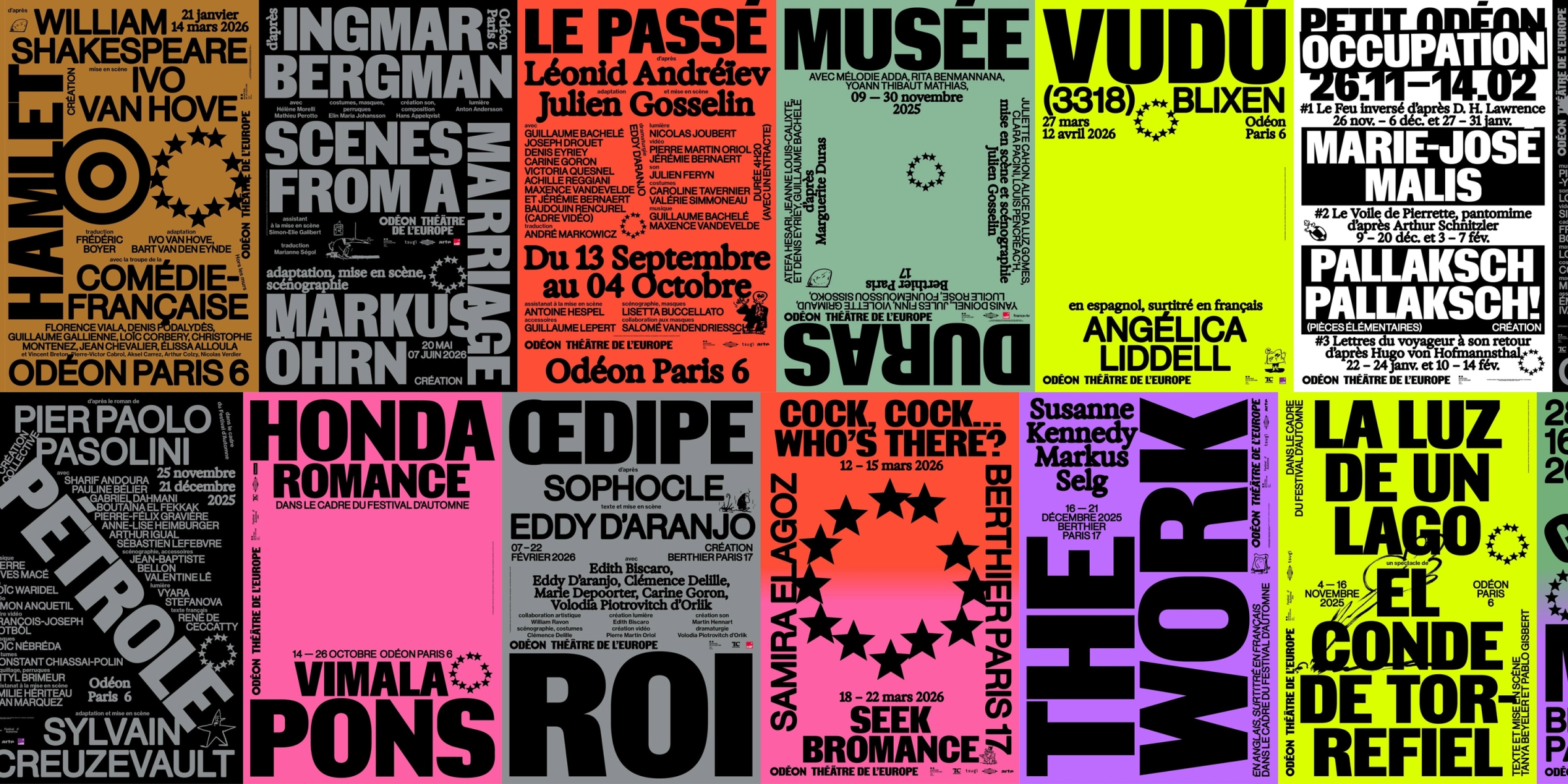
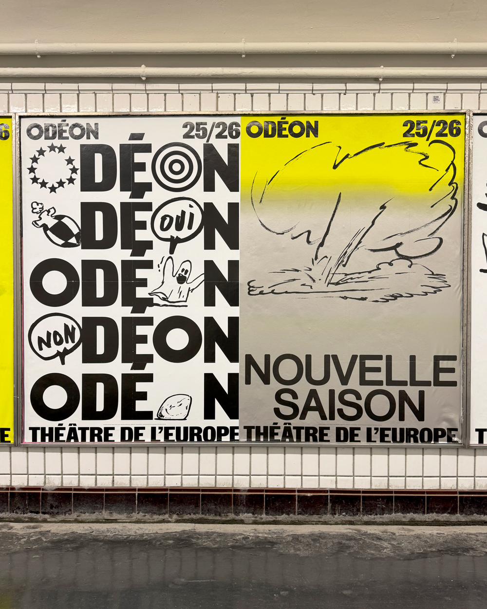
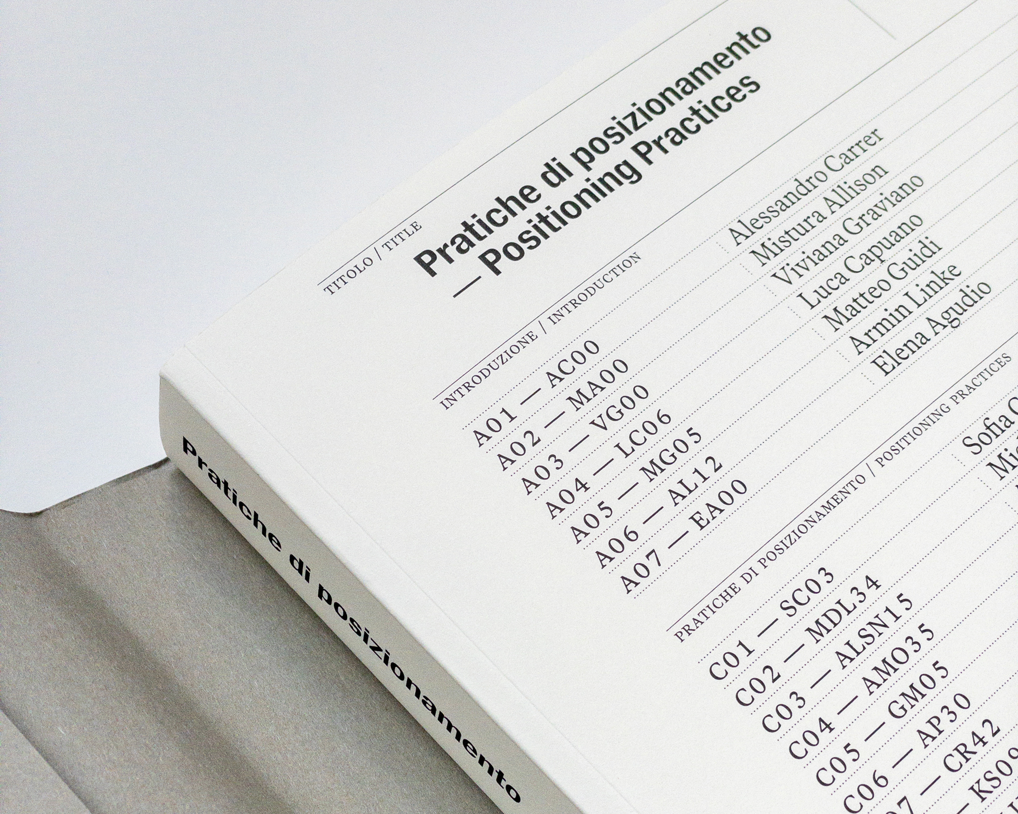
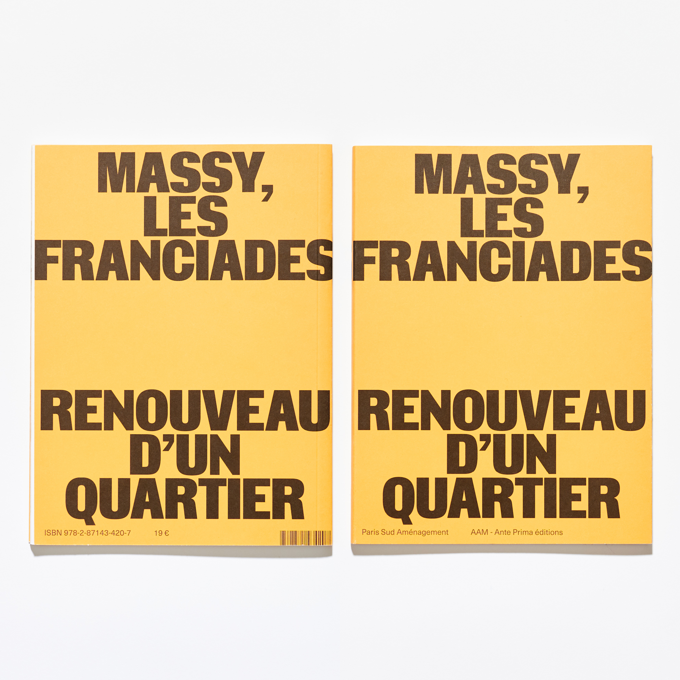
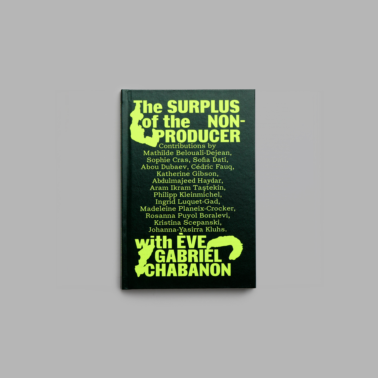
Insitu in use