Rillus
8 styles, 8 weights
Extralight, Light, Semilight, Regular, Medium, Bold, Extrabold, Black
8 styles, 8 weights
Extralight, Light, Semilight, Regular, Medium, Bold, Extrabold, Black
About Rillus
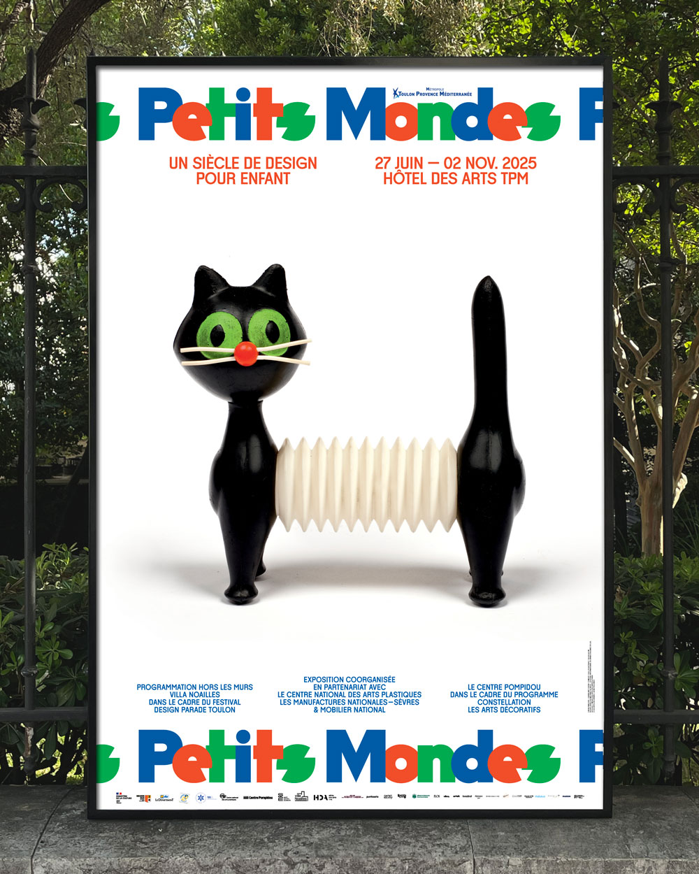
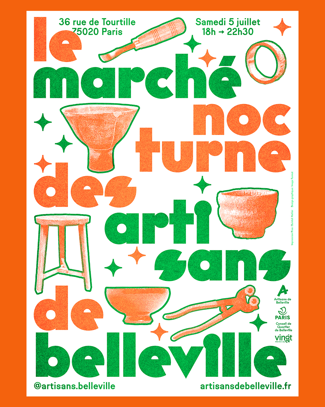
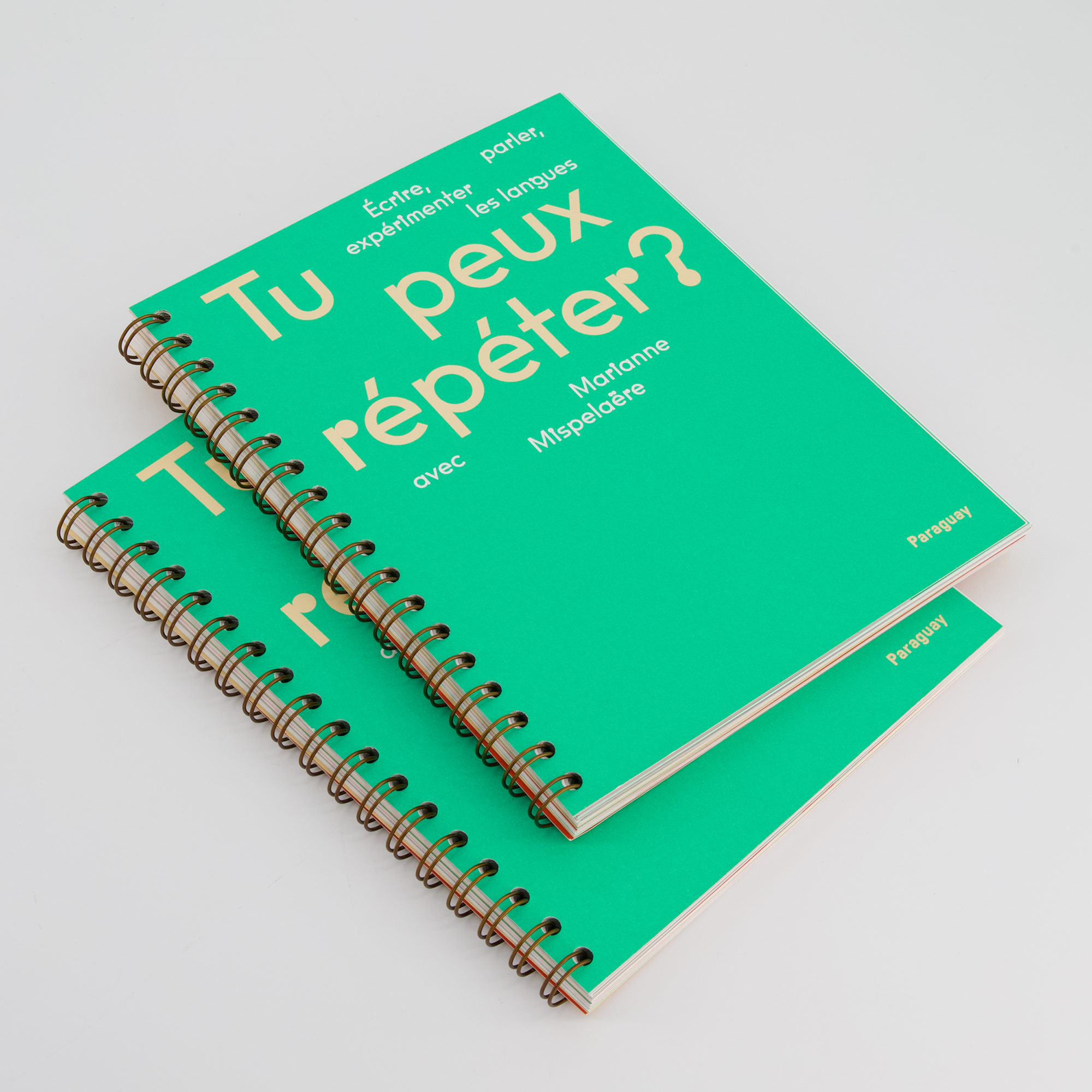
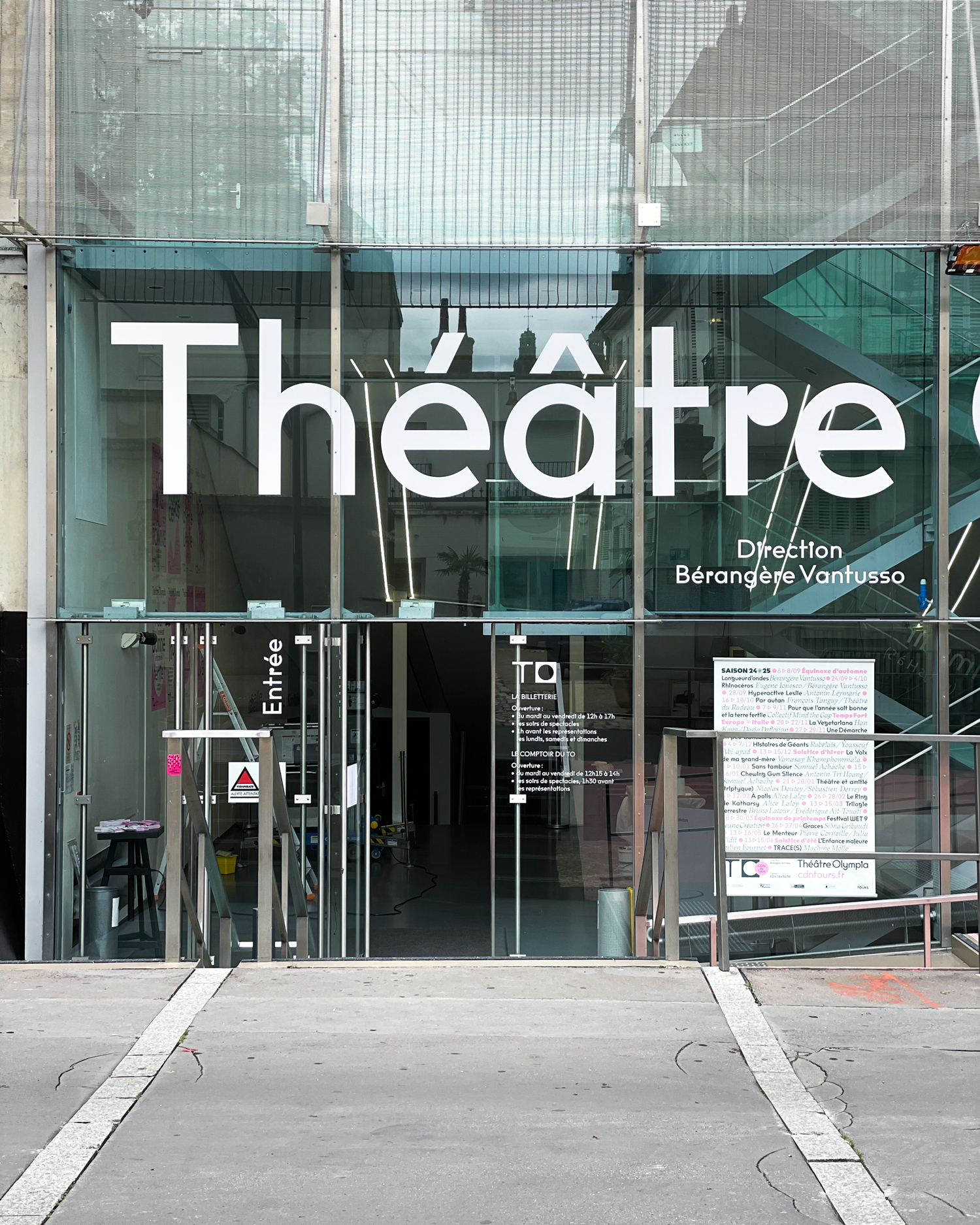
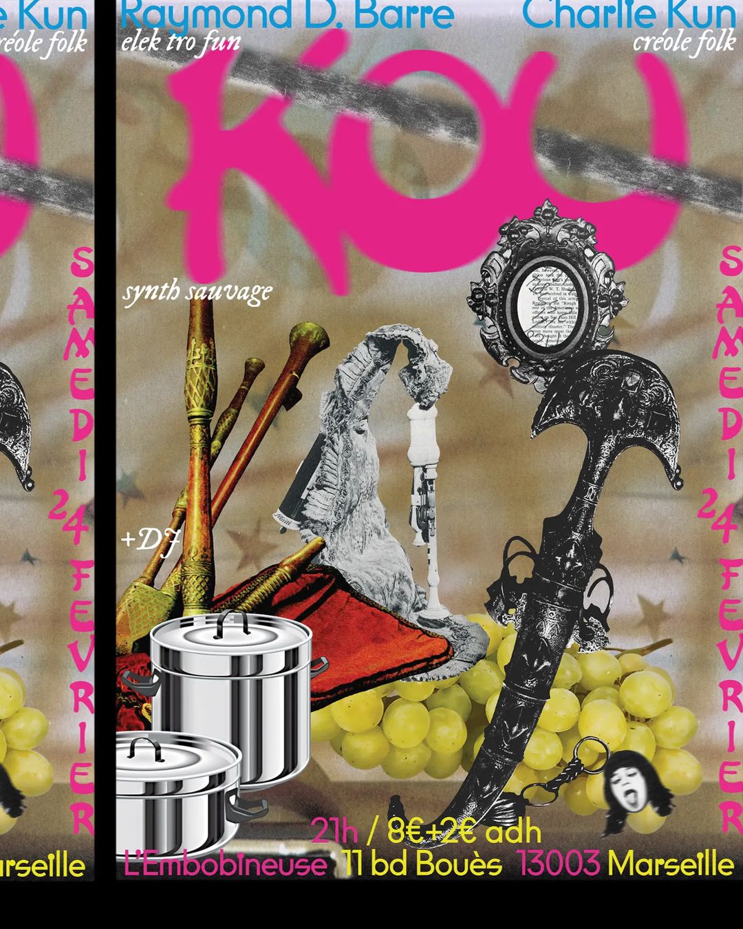
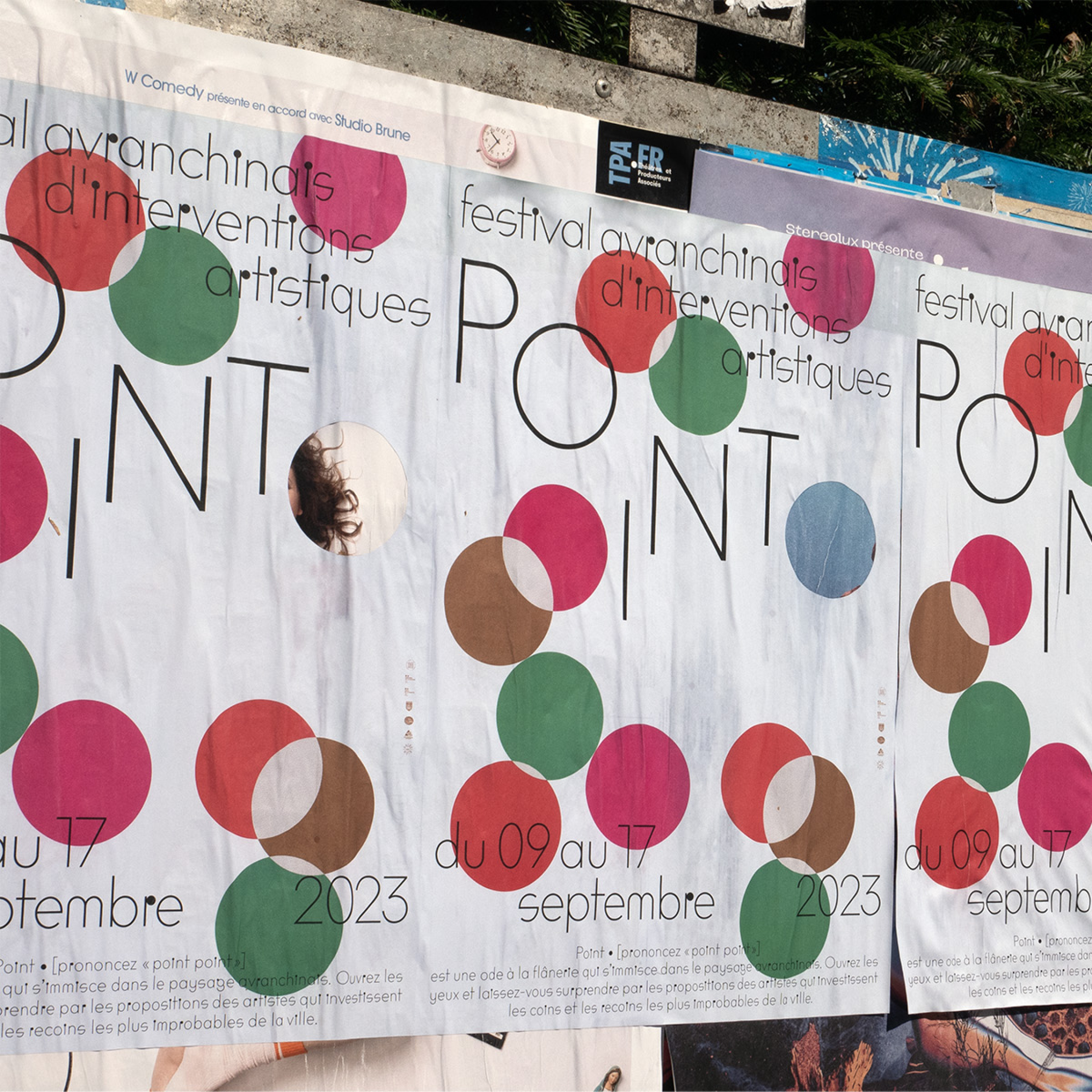
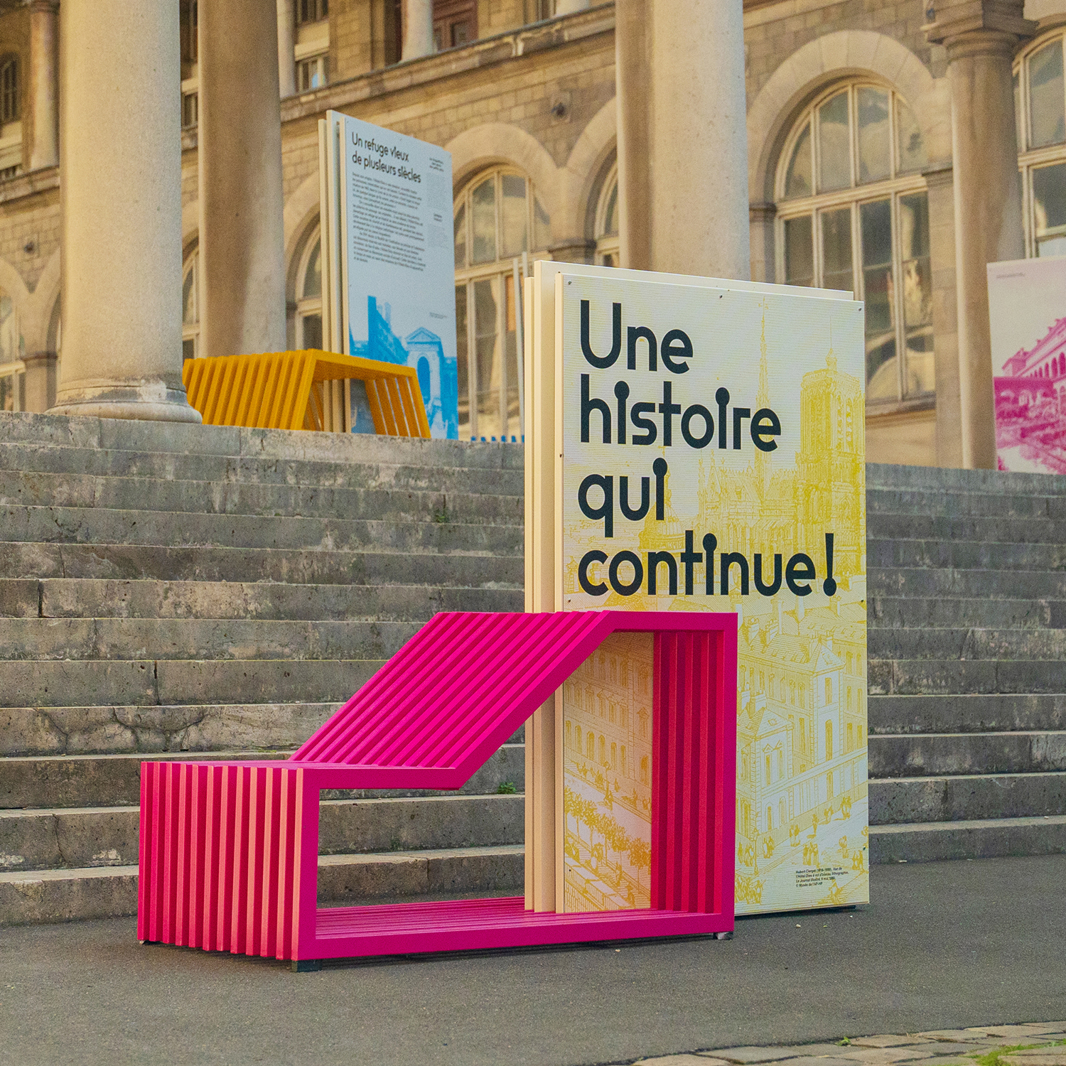
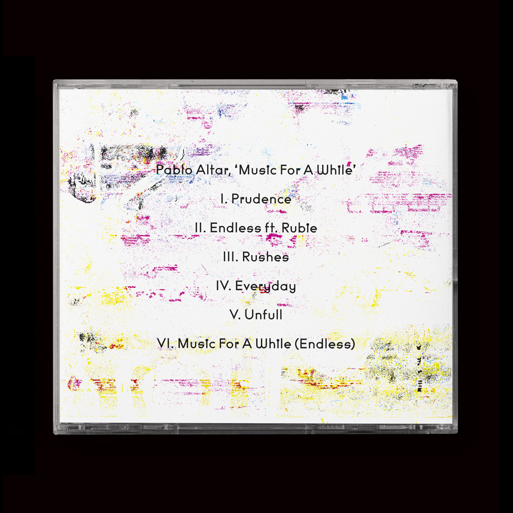
Rillus is a geometric sans-serif typeface based on a Swiss lettering from 1936. It seeks resonance in the great typefaces of its genre from the 20th century like Futura, Avant Garde or even the playful forms of photo-lettering Bauhaus faces. Its monolinear tone and enhanced dots can also evoke conceptual artworks from the 1970s, where simplicity meets wit. Rillus is round and friendly, yet intended to keep a radical approach, with its idiosyncratic letters like the closed-dot “i”, “g” and “s”. As the weight increases, letters get clogged up, conferring the display vibe we like to see in darker styles.
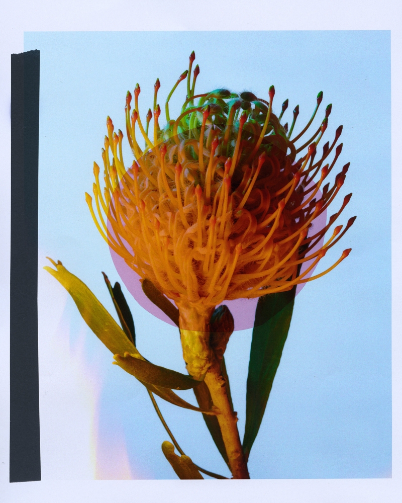
Photography © Charlotte Krieger
-
DesignerEmmanuel Besse
-
Release2023
-
Glyphs729
-
Single weightFrom 75,00 €
-
FamilyFrom 300,00 €
-
Award(s)Le Club des DA 2023 (3rd prize)

Type tester
678 ABSTRACT Concrete Standards
VERY
CLOSE
TO
SUMMER
The complete unit is normally mounted on a tripod, and the telescope can freely rotate 360° in a horizontal plane. The surveyor adjusts the instrument’s level by coarse adjustment of the tripod legs and fine adjustment using three precision levelling screws on the instrument to make the rotational plane horizontal. The surveyor does this with the use of a bull’s eye level built into the instrument mount.
A Platform Built for Speed
Nouvelle anthologie
du cinéma expérimental, 2012.
BLACK (61) BLUE (5) BROWN (6) BURGUNDY (4) GRAY (10) GREEN (39) NAVY (2) ORANGE (6) PINK (78) PURPLE (1) RED (24) TAN (1) WHITE (3) YELLOW (5)
Railways
under London
The bookshop is open today from 11am to 8pm!
Man in Business Suit Levitating was initially a part of the 1997 font Webdings, selected by the team developing Internet Explorer 4 as one of the font’s 230 icons. The designer of the Man in Business Suit Levitating icon for Webdings was Vincent Connare, who also created Comic Sans [1] and Trebuchet MS. [2] According to Connare, the original Man in Business Suit Levitating icon was based on the keyword “jump” and modeled after the logo of 2 Tone Records, which he saw on the cover of an LP record he had by The Specials, [1] a ska group that was one of his favorite bands. [3] The 2 Tone Records logo (named Walt Jabsco) was in turn based on the appearance of reggae musician Peter Tosh [1] in a 1964 photo of Bob Marley and the Wailers. [3]
⏺ SEARCH TAGS LIVE ⏺
⏮ LISTEN TO SHOWS ⏭
PICNIC
for
NEW
students
CREATURES
OF LIGHT
Old Pathways
to Hidden Worlds.
Old Pathways
to Hidden Worlds.
Building
Your Inner
Legacy
Character Set
Uppercases
Lowercases
Punctuation
Symbols
Case Sensitive Forms
Lining Figures
Tabular Figures
Accented Uppercases
Accented Lowercases
Fractions
Superiors
Inferiors
Numerators
Denominators
Mathematical Symbols
Ligatures
Alternates
Circled Numbers
Arrows & Ornaments
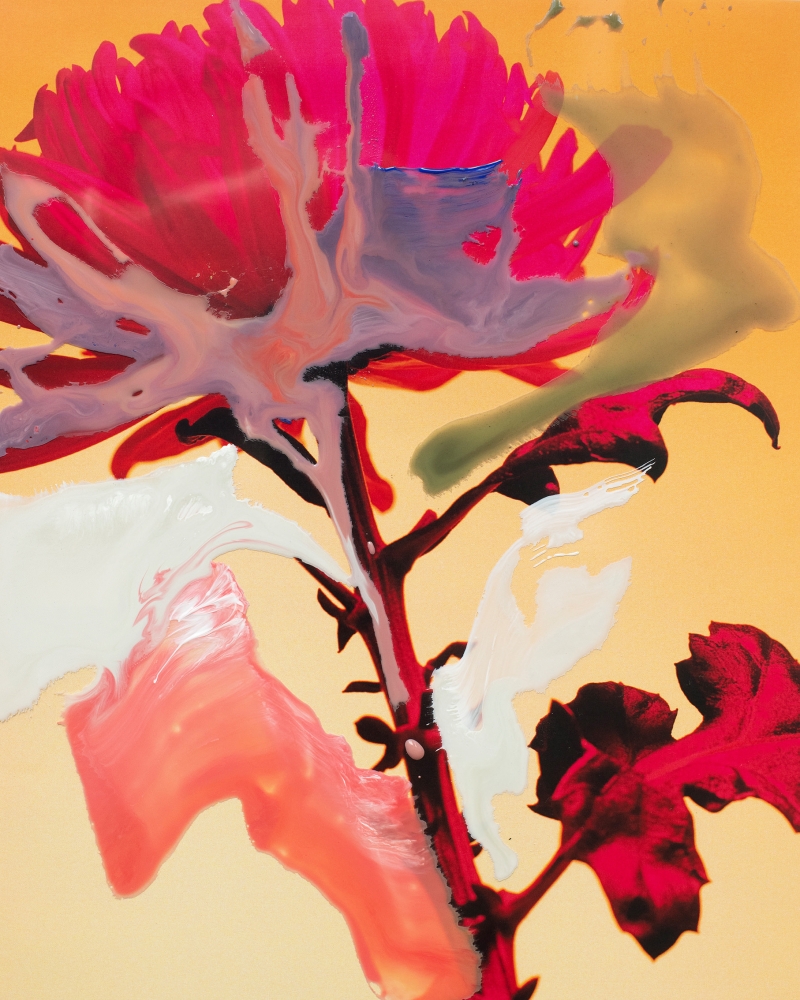

Rillus in use
